


lines up!
How to Make a Black & White Traditional Art Comic


Step 1: think of a concept… a joke, an idea, or whatever it is your comic’s about.
Step 2: figure out the pacing. Questions like: how many panels? what’s the best wording? how do you want to set the scene? do you need close-ups? wide shots? Insets? (Alternatively, skip this step and just draw, hoping it all ends up coherent in the end…)
Step 2.A: Realize your first version didn’t work out for whatever reason & you need to try all over again. Do so knowing that you’ve learned invaluable information on the first pass and the finished piece will come out all the better for it.

not enough space on the page to draw the whole poem without everything getting crunched… I like the insets of sadbook human seeing the dandelion, it adds to the idea that this just sprang up! out of an otherwise ordinary place and walk… with the full poem, the “key moment” (interaction between sadbook and dandelion) is lost, diluting the punchline. Also, I don’t like the idea of the dandelion getting stepped on (as happens in version 1). It’s too sad, but for no reason… it doesn’t translate the end of the poem well but instead goes somewhere thematically different. Spend more time teasing out the details of the key moment instead. What’s going on here? The “divinest sense” of the dandelion vs. the “starkest madness” of the environment around it. To add to that, give the chain-link fence a little more character with barbed wire on top. And now there’s space to draw the surroundings, too, and isn’t that interesting… the roads and the houses and cars, drawn from above, look strangely like trees…
Step 3: draw the comic strip (you can use thumbnail images to refer back to, or just go straight onto the page here, there’s no rules! [I do not use thumbnail images for sadbook, but I’ve used it for other projects—each project has its needs and the most important thing is to figure out a process that works and is streamlined for what you need to get done, how fast, the level of detail you’re working with, etc])
PENS ARE AWESOME.
Now if you’re drawing a traditional art black and white comic strip, the most important subject that may come up eventually is tools, and that means pens. (Or pencils! While a regular pencil will create a sketchy look, a mechanical pencil can create really nice black lines. But I would recommend a pen that flows nicely, so you don’t have to press down on the page a lot—which tires your hand much faster. Fountain pens are great to use for this reason.)
•,*.o.*.O•.*.o.*O*.•
don’t be intimidated by fountain pens! they are super easy to use and so fun…
Fine point platinum fountain pens (desk pens) are affordable and work really nicely! They have a wonderful fine point that’s great for detail work. You can’t post them (place the cap on the end) unless you get a little inventive with a saw, but it won’t stop you from drawing. The balance is also really nice, similar to a long brush. If you’re really into miniscule lines you might be tempted to get the “extra fine” size — which is a lot harder to find — but it’s actually not necessary! What’s great about these pens is they’re two-sizes-in-one! Just flip the pen (so the nib is “backwards”) and you can draw a thinner line! Many fountain pens can’t do this, so it’s a cool little detail.*
*of course you can use ink cartridges in this, as well as converters.
SOME THOUGHTS ON INK…
For The Sadbook Collections, I use platinum carbon ink, which has a nice, very smooth flowing line with a wonderful shade of black, absolutely fun to use. Unfortunately, it tends to smudge a lot because it doesn’t dry immediately, so for really intensive, large-scale designs I wouldn’t recommend it. My kuretake brush pen comes with a beautiful ink (my favorite one actually) which is an incredibly deep and lovely shade of black that is great to work with and dries very quickly. I’ve never tried that ink in my platinum pen but it would probably do quite well…
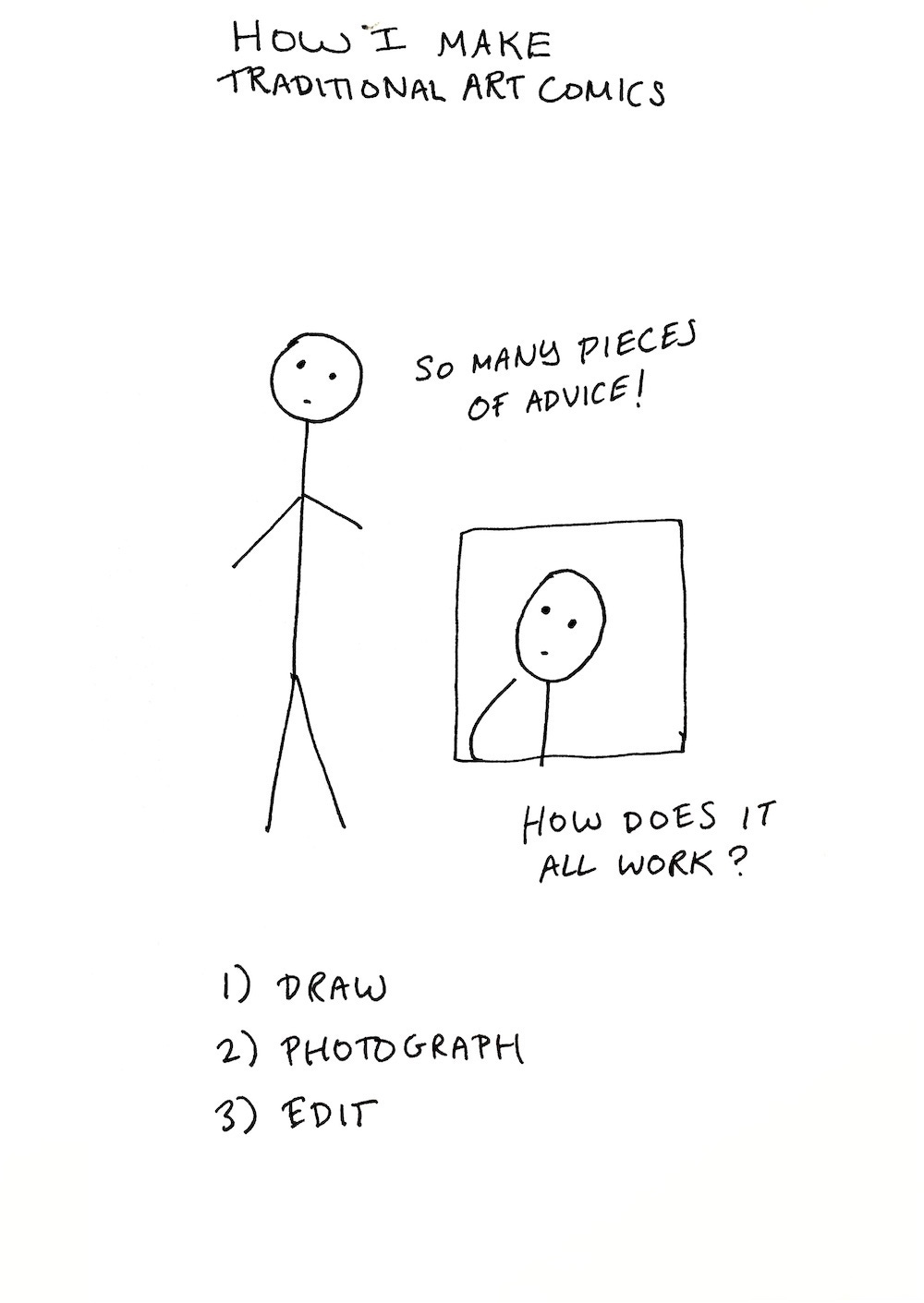
Step 4: Time to use your handy-dandy smartphone. Ok, if you have a scanner, go for it instead, but consider: if you draw in a wire-bound sketchbook it can be hard to lay your pieces flat on the scanner, and also… scanners also sometimes don’t do great with lineart. What they do really nicely is get a straight-on image with even lighting, but a nice photograph can do just as well really… and then you don’t have to go to all the bother of moving stuff around… yes, smartphones take great photos, really high quality ones, there’s no need to go high-end-art about it especially with lineart. If there’s shadows in the pictures (and there will be shadows) that’s what post-production is for.
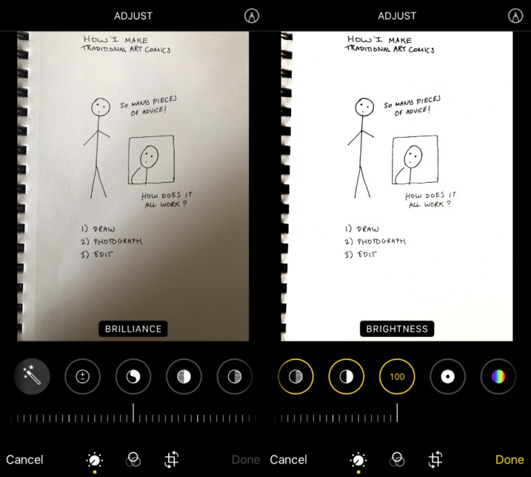
Up the brilliance, highlights, brightness, contrast, and turn the saturation and shadows all the way down. Mess around until you’ve got a picture you like; depending on your style, different kinds of edits will be needed. I move everything onto my computer eventually where in preview* I can clean up anything really egregious (spelling mistakes, lines I want to get rid of, etc) and do a few final fiddles with the brightness and contrast if I have to. For more detail-heavy pieces where you want to clean it up quickly and easily on your phone, snapseed is a free app that will save you so much heartache. I don’t use it for sadbook because the extra step of importing it into the app and then exporting it takes up just that much more time — but for pictures with black planes of filled-in areas I use it a lot, because that tends to get messed up if you edit it in your basic phone editor.
*And if the thought of editing in preview fills you with terror, you can always try photopea (online photoshop).

What I love about art -- visual or written-- is that you can often start something with a clear vision, but then the medium itself (and the piece itself, in a way) tells you what to do next, and can change that initial vision.
Wonderful essay and insights!