I’ve always really loved the kind of stylisation that comes from textural, photograph and film artifacts. There’s just something so cool about it, & especially when combined with genre mash-ups, one of my favorite things to do in any kind of art.
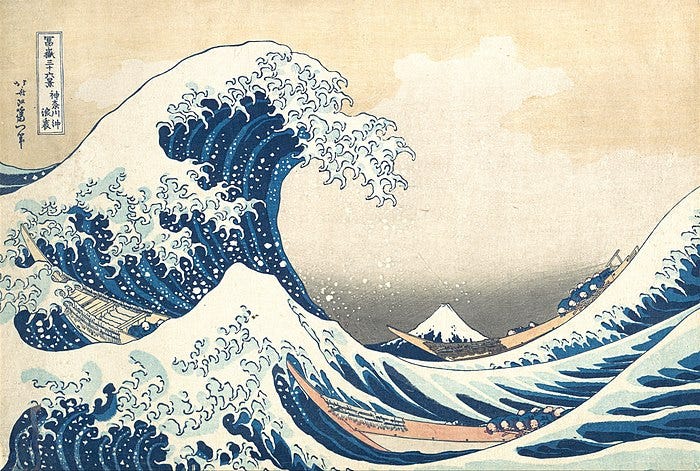
And then there’s The Great Wave Off Kanagawa. Super famous picture by Katsushika Hokusai, Japanese printmaker in the 1800s. You’ve probably seen it before—and if you haven’t seen it, you’ve probably seen stuff inspired by it.
^ It’s this by the way :)
Who knows why it’s remained so popular? All I know is, wow, those waves are awesome.
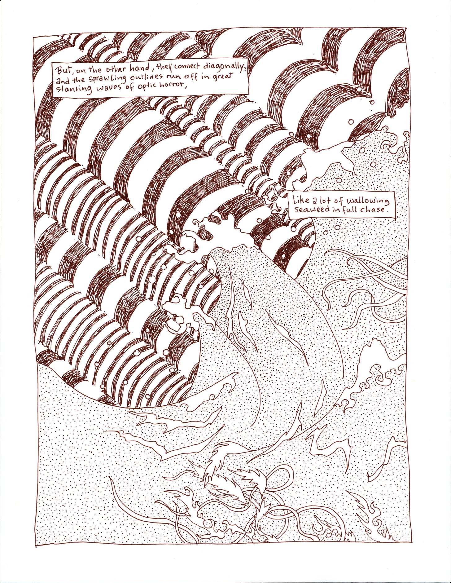
I’ve used inspiration from it before, for a section in my horror graphic novel The Yellow Wall-Paper Graphic Novel, the part that goes:
“but, on the other hand, [the lines of the wallpaper] connect diagonally, and the sprawling outlines run off in great slanting waves of optic horror, like a lot of wallowing seaweed in full chase.”
Charlotte Perkins Gilman (the writer of the story) is so good at creating imagery. In barely two sentences we’ve got so much going on… and great slanting waves of optic horror? Epic. Yeah, my brain kind of went ‘great waves’ + ‘optic horror’ = ‘the great wave picture’ + ‘an optical illusion’ which ended up with one of my favorite pieces in the entire graphic novel:
Just the way these two images smash into each other, creating something incomprehensible and incredible and full of movement— the waves, the way the “optical illusion” section almost gets at sound-waves, too, the seaweed reaching out in there, it’s all moving and churning, there’s so much going on.
Another artist I’m so inspired by? Warakami Vaporwave. This person just does the most fun & clever stuff. Talk about movement & mashup. It’s like you can just touch it, it has shape and texture under your fingers—even though it’s completely digital!
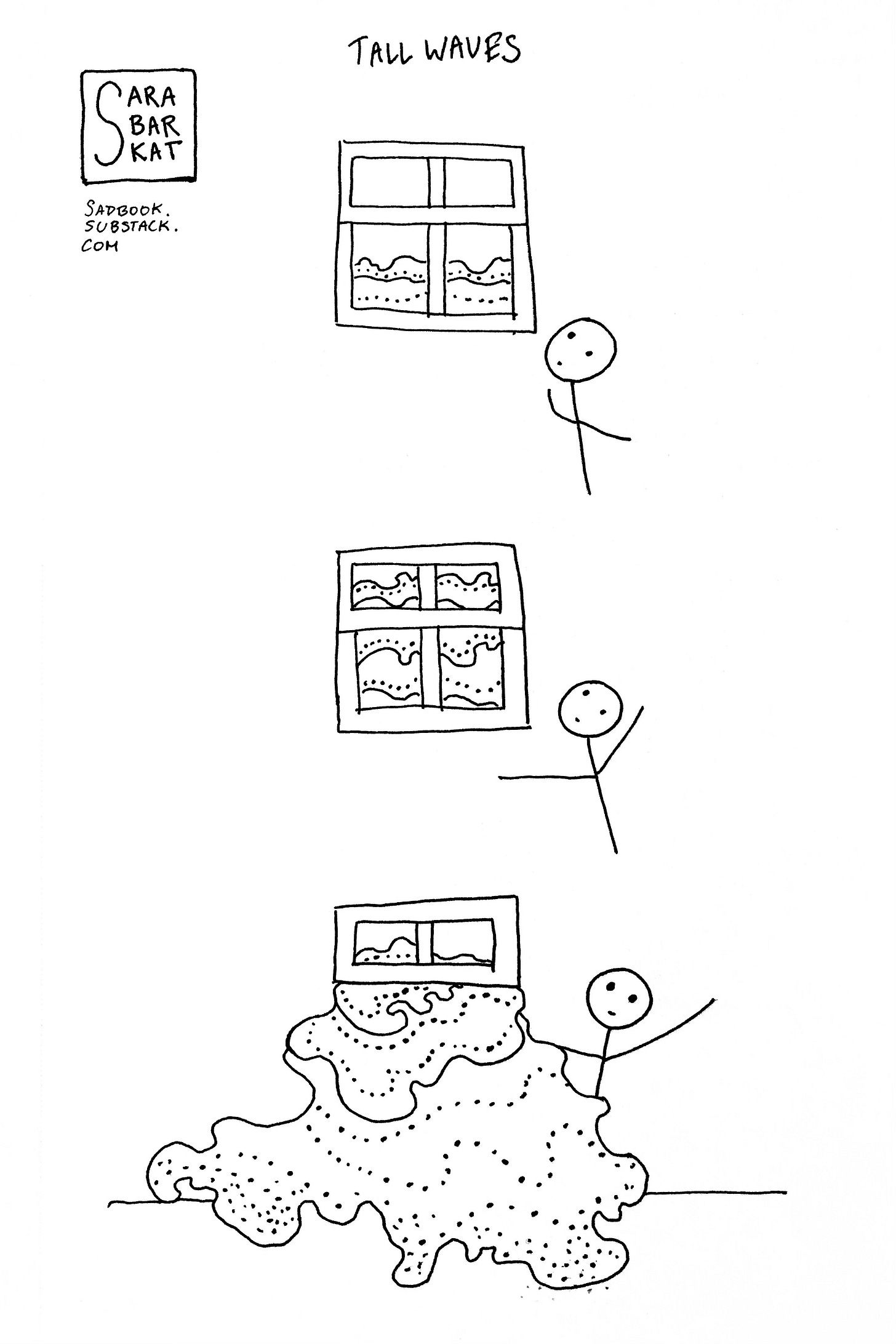
Recently I had a dream that I was in a room that was also a boat, and outside the window the sea was rising. With each roll of the waves, water came right into the room, and then when the waves receded, out it went again. It was awesome in the ‘awe-inspiring terror (and incredibly cool)’ sense of the word. That turned into a comic strip:
But then I thought, well, why stop there? I recently saw Warakami Vaporwave recommend Vault of VHS as a super cool place for inspiration, which is, you might guess—a bunch of pictures of VHS covers. One in particular had an absolutely beautiful color palette.
So I decided, well—why not try my hand at a little coloring?
I started with the idea to make an all-new wave comic, one that would look (hopefully) great in color. For inspiration, I read the Wikipedia page on The Great Wave (as you do). I was struck by: 1) how cool it was 2) how much I love printmaking [not necessarily a surprise, since I took printmaking classes in college, but always good to remember] 3) pigments! prussian blue! A new pigment imported at the time, and so able to be used instead of indigo, and in consequence creating the possibilities for completely new kinds of art, completely new kinds of color (I love learning about pigments) and 4) this sentence: “Hokusai's goal for the series appears to have been depicting the contrast between the sacred Mount Fuji and secular life.”
That thing I was saying about how incredibly fruitful mashups are? That sentence stuck with me for some reason. I knew I wasn’t going to draw the Sadbook Human in front of Mount Fuji, but I wasn’t entirely sure where to place it. After that sentence though, I knew exactly where Stick Figure had to be: in front of New York City. The image or idea of NYC with ever-more towering waves around it has been a persistent one in my mind for years. There’s something there about fear of the future, thankfulness for the present, recognition of what water gives, the opportunities and the danger of it—that sense of liminality and time.
HOW TO DIGITALLY COLOR A BLACK & WHITE LINEART
There’s real ways to do this, or so I’ve heard. My style is unfortunately incredibly messy, because although I use it a lot, I actually can’t make heads or tails of online photoshop and the delicacies of “separating the linart from the background” are absolutely beyond me. I was on there trying to follow like 2 separate tutorials, dragging stuff around, and making zero (0) pieces of art. So then I said eh whatever, I’m doing it the “wrong” way. Much good art, unfortunately (or fortunately, depending on your perspective) is made the “wrong” way.
In this case that meant opening up my black and white image on blend mode multiply, sticking my color palette png behind it for inspiration, realizing that looked super cool actually, messing around with the color picker and painting in further details until I got something that looked nice and then slapping a bunch of vhs overlays on top. Oh yeah, and then making another copy of my original lineart, opening it in preview, and using the magic eraser to erase the white background. (You see, I wasn’t lying about my hectic process). And then just pulling that on top of everything else to create the finished picture! Which, if I do say so myself, looks pretty awesome.
Stick Figure Human experiences the great wave off New York City. This boat trip is very dramatic!
p.s. if you like this picture, it’s also available as a poster in my shop — so you can get it and see the adventures any time you look on your wall :)
~o~0~o~


I'm loving my great wave poster (the colors are so vibrant!) and really love getting this backstory and seeing the production process. :)
this is wonderful.
and one of my absolute favorite things here is the very last thing: the waves "emoji" you made from O's and tildes (read that fast and it looks like "tides" :)